
Adelco
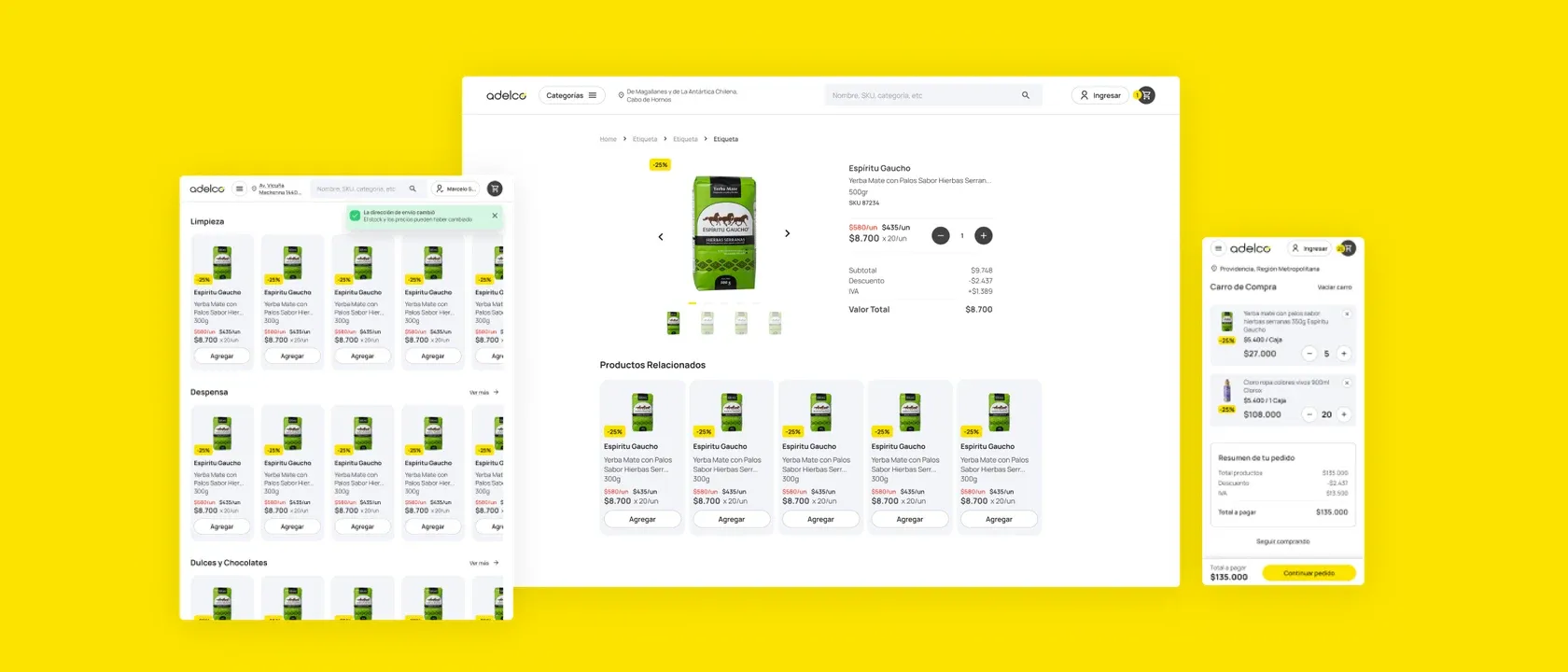
A unified platform for a Chilean wholesale retailer: e-commerce, a sales rep app, and a management panel, designed as one suite.
What they needed
A slow sales process and employees juggling several disconnected apps.
What I did
A suite of three products: e-commerce, a sales-rep app and a management panel.
The result
80% fewer clicks to find a product and 30% more returning users.
Starting point
Adelco is a wholesale retail company in Chile, an industry leader for decades. It needed to take a radical step toward digitization: improve its sales and management processes and modernize its relationship with customers and employees. The whole product is built for the Chilean market: Chilean Spanish, RUT, regions and communes, and Chilean pesos.
Several problems were stacked together:
- A slow sales process, with frustrated customers abandoning before buying.
- Employees juggling several apps, with a fragmented workflow.
- Customer confusion and lack of trust in the service, hurting sales and loyalty.
- Low engagement and sense of belonging in the team.
All of that translated into significant financial losses.
What I did
I built a suite of three products, each aimed at a specific pain point and together covering all the company’s needs:
- Responsive e-commerce for customers: catalog with categories and filters, product page with unit and box price, cart, checkout and “My account”.
- Mobile app for sales reps, with visits organized as pending, done and off-route, and each customer’s payment and delivery status.
- Web management panel for desktop and tablet, with users and roles, customers and territories.
I started from research with personas and journeys (the “frustrated buyer” and the “disengaged employee”), defined the user flows and used atomic design so the three products feel like one. I also designed the new-customer onboarding, with clear validations at every step.
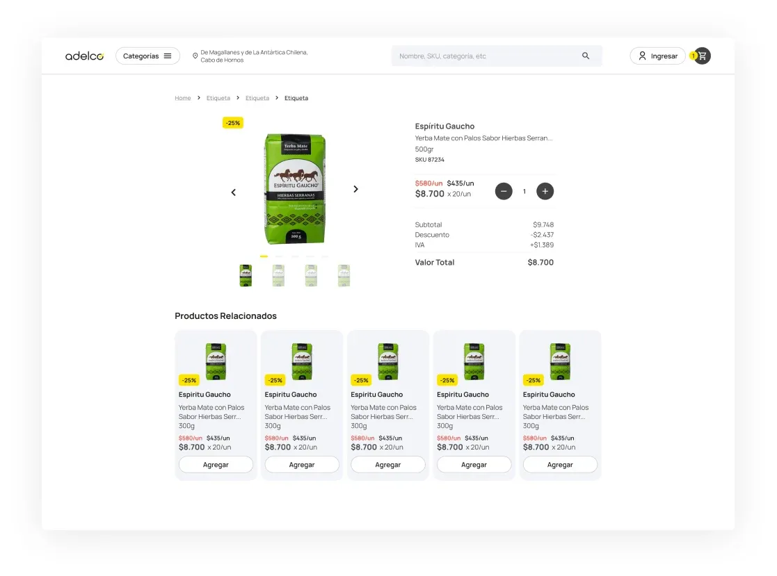 01 · ProductEverything to decideUnit and box price, subtotal, discount, tax and related products.
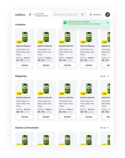 02 · ListingClear categoriesA simple listing, also designed for tablet, with useful notices such as a shipping address change.
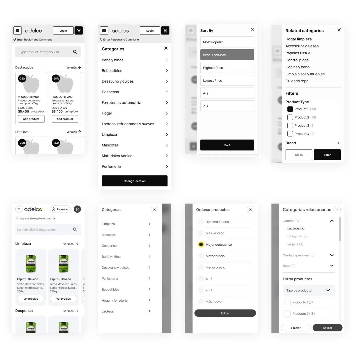 03 · MobileFrom wireframe to final designHome with highlights, category menu, sorting and filters, solved first in wireframes.
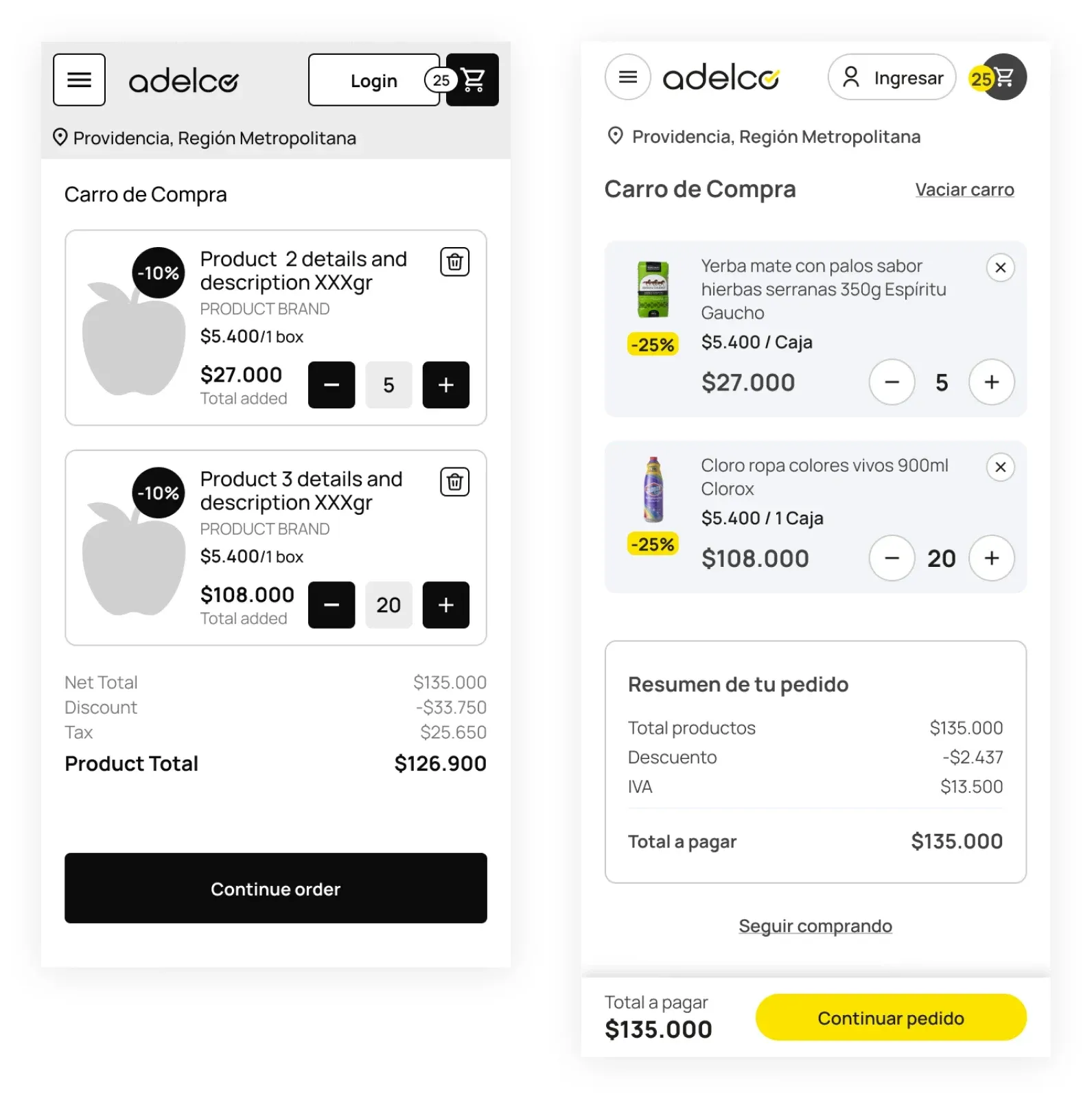 04 · CartOne clear stepDiscounted products, order summary and a yellow button to continue.
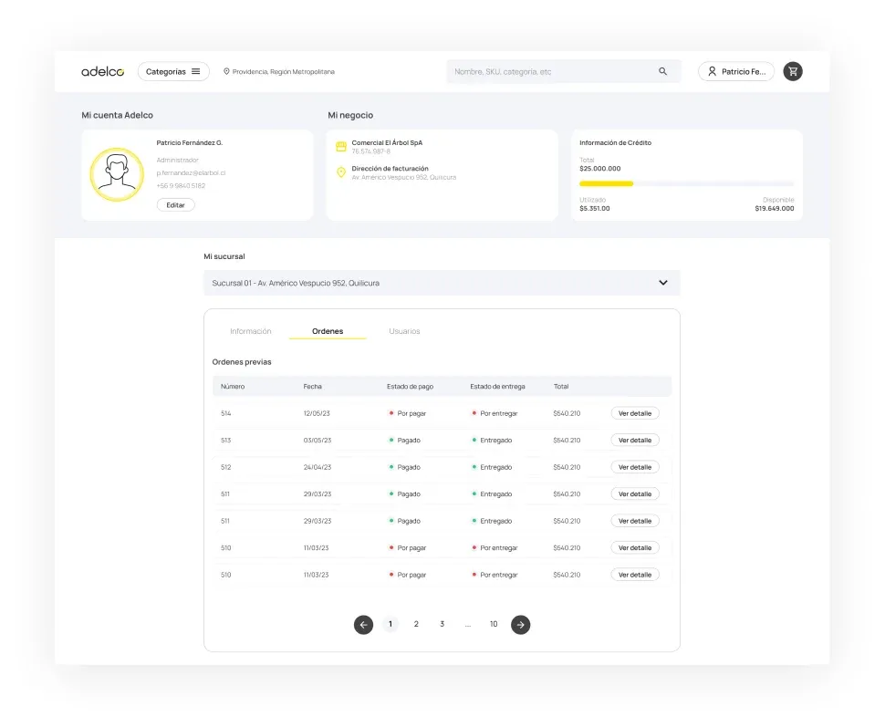 05 · My accountOrders under controlPrevious orders with payment and delivery status, business details and store credit.
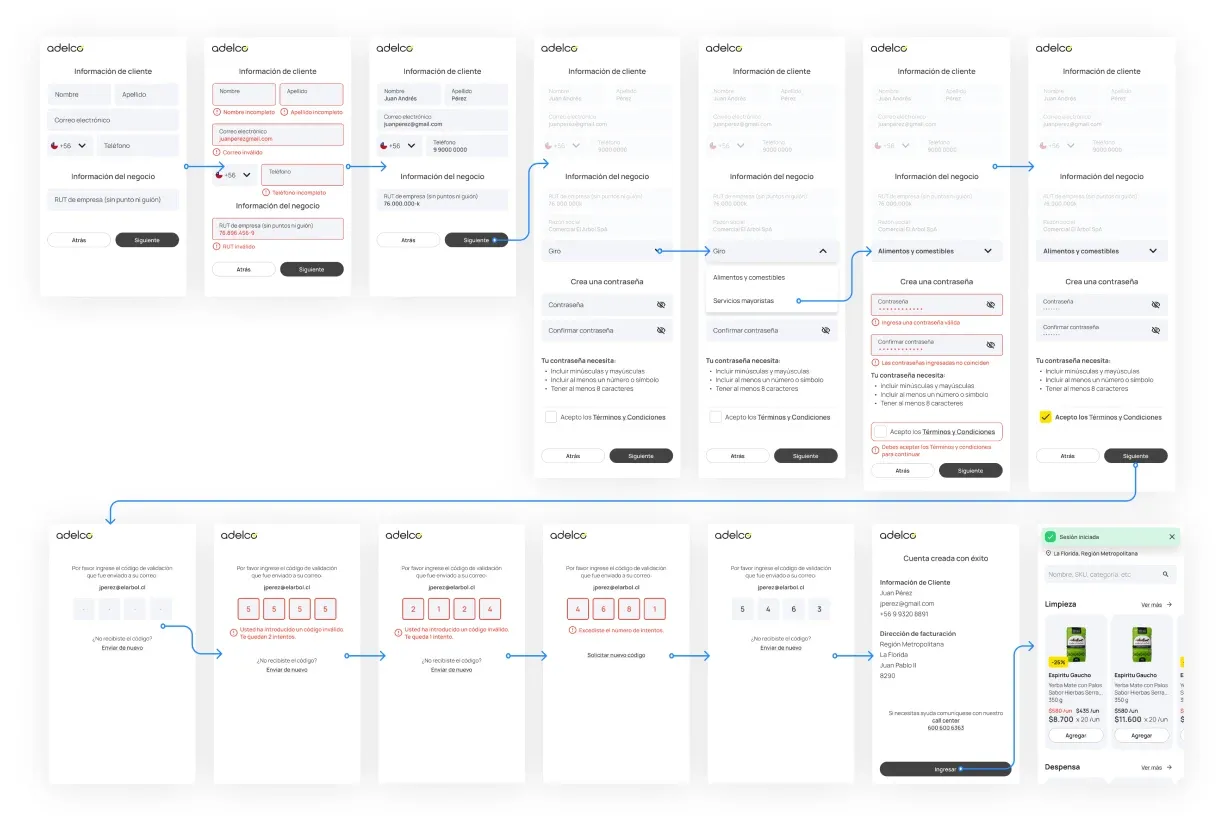 06 · OnboardingSigning up new customersBusiness details, password and email validation, with clear error states.
Result
The redesign improved product discovery and navigation for B2B users on a complex wholesale platform, and simplified bulk purchasing.
- 80% fewer clicks to find a product. Redesigned product cards and clearer labels make it easier to identify the right variant and quantity.
- 40% shorter visit. Purchases are completed faster, without going back and forth between categories.
- 30% more returning users. Simpler flows and better visibility brought more customers back, buying with more confidence.
My role: Product design, research, flows, atomic design and interface for the e-commerce, the sales-rep app and the management panel.